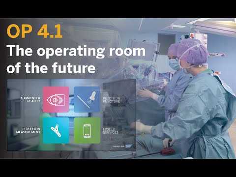
One of the key applications on the OP 4.1 platform prototype is the OP 4.1 dashboard. Designed to help provide surgical teams with relevant information at the right time, it leaves them free to focus on what matters most: their patients.
At each phase of a surgical operation, the OP 4.1 dashboard displays data pulled from various sources according to need, providing surgical teams with vital information in a way that makes it easy for them to consume it. The data they need for an operation appears on a 47-inch touchscreen monitor placed between three and five meters from the operating table, where anesthetists, surgeons, and other medical and nursing staff can see it clearly.
The monitor’s main function is to display all the information about a patient and the operation he or she is undergoing at the precise stage in the process when the medical team needs it – before, during, and after surgery.
This article is part of the series
OP 4.1: The Operating Room of the Future
Despite all the groundbreaking innovations in the healthcare sector, isolated applications are often used. As a result, the full potential is not yet being exploited. The OP 4.1 project developed a prototype of an intelligent platform for the operating room of the future. The funded project is part of the technology program “Smart Service World II,” which is funded by the German Federal Ministry of Economics and Energy (BMWi). In this series, find out how the prototype enables the integration of data, technologies, and different sectors, while at the same time creating the balancing act between networking and solid business models that are the basis for any collaboration.
End-User Focus a Principle of UX Design
User experience (UX) design provides the foundation. UX designers start with the software user’s story and work backwards to create a design that will deliver maximum benefit. Thus the design and development process for the OP 4.1 dashboard began with a detailed assessment of how modern surgical teams work today.
When a patient has surgery, the information the medical staff need about that patient comes from different sources and in different formats/ Medical records are usually paper-based; patients often supply visual material, such as CT and x-ray images and the like, on a USB flash drive or similar; lab results are displayed on a PC, like in Cerner i.s.h. med from SAP; and patient consent forms are submitted on paper.
As a result, the medical staff have to draw together the information they need from multiple sources themselves. They can then plan the operation. Once at the operating table, the surgical team has to cognitively link existing patient data with the information that is generated during the operation as they work. This is where the OP 4.1 dashboard comes in – its aim being to bundle information and display it precisely as and when the operating team needs it. For that to happen, it is vital that the dashboard’s design is as user-centric as possible.
How the Dashboard Was Developed
The first task for the dashboard’s designers was to identify all the different sources of information and to find out – by holding user research sessions – what data was required at which point during surgery. Thanks to these sessions, the designers not only learned a lot of detail about surgical processes, they also discovered a great deal about the needs and wishes of the operating teams. On top of that, Heidelberg University Clinic arranged for the UX designers to sit in on operations and observe surgeons as they worked.
Equipped with the input they had gathered, the designers were able to build a basic grid layout, which then passed through several iterations before achieving its current look. Using this design approach means that end users are involved in development processes and can provide validation along the way.
OP 4.1 Dashboard Close Up
- On the left-hand side of the dashboard is an accordion drop-down menu listing the various phases of surgery.
- The shell bar at the very top of the screen shows the operating room logged on as a user. Here, the operating surgeon can also make the appropriate settings for the operation. The shell bar also contains the voice interaction icon.
- Directly below the shell bar is the header. This permanently displays key basic information – such as the total duration of the operation and a stopwatch – that is relevant for all the defined user personas.
- On the far right of the screen is the app drawer, a slide-out side panel displaying third-party apps that medical staff have defined in advance as relevant for the operation.
- The content area in the center of the screen contains various tiles that change dynamically at each stage of the operation. They summarize all the relevant information and make it visible at a glance. Some of the tiles can also be opened to display more detailed information. The content area is also scrollable so that content can be accessed quickly if the operating surgeon has activated more tiles in the settings than can be displayed simultaneously on the screen.
Further user research sessions were held to validate this layout with the medical teams. In this way, the dashboard was optimized in several iterations to meet the needs of the two main personas: anesthetists and surgeons.
Once this process was complete, the design was discussed with the SAP UX team to help ensure that it aligned as closely as possible with SAP’s current design language and guidelines, in this case, the SAP Fiori 3 Quartz dark theme.
App Guidelines for Third-Party Providers
In addition, special design specifications were developed for applications from third-party providers. These were implemented in the first apps built for the dashboard by the German Cancer Research Center (DKFZ) and mbits imaging GmbH and validated with end users.
The third-party apps deviate from the SAP Fiori 3 Quartz dark theme guidelines used in the dashboard because, unlike the dashboard, they require certification as medical products. Nevertheless, the app designs are closely aligned to the look and feel of the dashboard that end users do not perceive any difference.
Focus on the Patient
The aim in designing this clearly structured dashboard was to make it as easy as possible for users to work with, and to put patients front and center. The dashboard helps surgical teams focus their skills and energy on their core tasks and, as such, supports gentle, successful, and efficient surgery. And by leveraging digital technology and connectivity in the operating room in this way, it provides a compelling insight into future possibilities that could benefit everyone.


This story originally appeared on the SAP Germany News Center.
Top image via video screenshot.


