July is Disability Pride Month. It emphasizes the importance of creating a world where individuals with disabilities have equal access to opportunities, resources, and services.
Making our work environment accessible and creating a culture of inclusion and belonging is everyone’s responsibility and benefits everyone. As content owners, it is on us to ensure that all content is consumable by every viewer, regardless of ability.
Why Is Accessibility Important in Communications?
Inclusive and accessible communications play a pivotal role in ensuring that messages are available and comprehensible to all, including those with disabilities or limitations. The significance of accessibility in communications cannot be overstated, as it fosters equal participation and engagement.
People with disabilities currently represent about 15% of the world’s population.

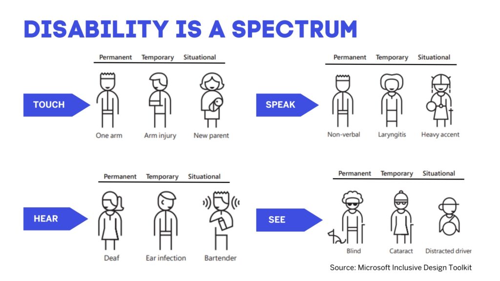
Being mindful of the continuum from permanent disabilities to situational impairments helps rethink how designs can scale to more people in new ways. In the United States, 26,000 people a year suffer from loss of upper extremities. But when we include people with temporary and situational impairments, the number is greater than 20 million.*
Ask yourself, what is this experience like for people who can’t see, can’t hear, can’t use a mouse, can’t remember what they were doing, or can’t speak clearly, and is it usable?
Practical Tips to Enhance Web Accessibility for a Diverse Audience
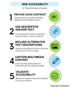
Provide alternative text for images. Use descriptive alt text to convey the image’s semantic meaning – not to explain what the image visually shows – and the context of the images to individuals who have limited vision, have only a limited field of sight, or use screen readers. This ensures they understand the semantic context even if they can’t see the images.
Use descriptive anchor text. Instead of using generic phrases like “click here” or “read more,” make link text descriptive and meaningful. It should clearly indicate the destination or purpose of the link, such as an action and to which object or instance the action takes effect. For example, use “download the accessibility guide” instead of “click here” or “download,” as it might not be obvious what will be downloaded. Learn more about why not to use “click here” as link text.
Avoid lengthy URLs. Long and complex URLs can be confusing and difficult to read. This is especially important when links are generated and the reference contains so-called GUIDs, which contain extremely long mixtures of digits and letters. Consider using link-shortening services or customizing the hyperlink text to make it more concise and user-friendly.

Format hyperlinks differently. Visually distinguish hyperlinks from regular text by underlining, bolding, or using a different color. This helps users easily identify and recognize clickable links. Different colors might not be helpful for individuals who have problems in perceiving colors or being able to distinguish a color from another. However, screen reader users can get the information that a link is a link, independent from its visualization. The screen reader can determine the link’s technical type. Additionally, a screen reader retrieves information if a link redirects to a spot on the same site or if the link has been visited before, indicating it as a visited link, when using a specific link navigation mode.
Ensure sufficient color contrast. Make sure there is enough contrast between the hyperlink color and the surrounding text to ensure readability for people with visual impairments. Avoid relying solely on color to convey the presence of a link. Use the contrast checker tool to check the readability of your design and content.
Include context and purpose. When linking to external content, provide a brief description or context within the surrounding text. This helps users understand the purpose or relevance of the link before clicking on it.
Test accessibility with screen readers. Use screen reader software or tools to test the accessibility of hyperlinks. Screen readers should be able to accurately identify and read out the hyperlink text to ensure it is understandable and meaningful. Improve content for screen readers by using the Microsoft Accessibility Checker.
Avoid excessive use of hyperlinks. While hyperlinks are useful for providing additional information or references, avoid overloading your content with links. Too many links can be distracting and overwhelming for some readers, especially those with cognitive disabilities.
Test on different devices and platforms. Ensure that hyperlinks function correctly and are accessible across various devices, browsers, and operating systems. This helps guarantee a consistent and inclusive user experience.
Caption and transcribe multimedia content. Provide captions for videos and transcripts for audio content. This is vital for users who are deaf or hard of hearing. It is also useful for international comprehension and for those who cannot play audio or video.
Sign it. Provide sign-language interpretation services for all live events and include this in the replay where possible. By default, SAP uses American Sign Language (ASL), but may use other sign languages depending on the location of the audience.
By following these practices, you can make your content more accessible and ensure that all users can understand and interact with your content effectively.
*Source: United States Census Bureau, Limbs for Life Foundation, Amputee Coalition, MedicineHealth.com, CDC.gov, Disability Statistics Center at the UCSF
Alexander Kuban is UX designer and IT technology consultant for Accessibility at SAP.


